
Salon Management Software Redesign
Revitalizing a two-decade software business for salon business owners
Overview
I, with help from my team, reimagined DaySmart’s salon software for over 12,000 salon and spa owners.
Organization
DaySmart Software
Project Type
Internship — UX Design — B2B — Web
My Role
Led design in these following workflows:
Appointment booking
Products & Services
Employees
Team (of 5 + 3) 🙏🏽
Tonya McCarley, Product Manager (my manager)
Harry Kim, Design Intern
Vaidehi Mechant, Design Intern
Kyle Chang, Design Intern
Mingda (Me), Design Intern
Patrick Curley, CPO
Ryan Cibor, Development Lead
Kashia Xiong, Software Developer
Problem & Context
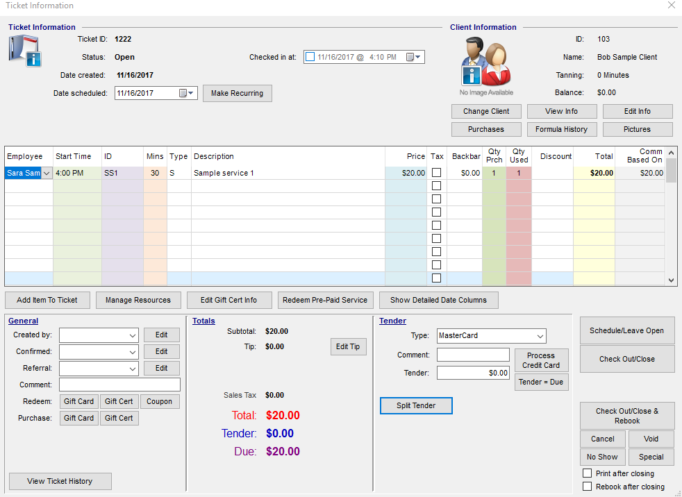
DaySmart’s salon and spa software as a service (SaaS) has been designed based on legacy Windows operating systems. Their desktop and cloud versions of the software violate basic design principles, including consistency, information overload, confusing user flows, and lack of progressive disclosure.
Solution
I redesigned the software’s key user flows with a focus on reducing, for example, appointment booking time, and other turnaround times with customers.
Measures of Success
Based on new user feedback, the new released designs have led to significant improvements in amount of time used for completing key tasks such as appointment booking. This has reduced client wait times and has increased the satisfactions of our customers’ clients!
As a result of my work, DaySmart’s customers, especially small businesses, are slowly moving to the cloud version and finding it more efficient!


Part 1: What’s the problem? 🕵️
I focused on four activities to fully understand the context of the initiative before designing.
Personas
Cognitive walkthroughs
Competitor products
User reviews and feedback
Personas
I met with the Chief Product Officer and other stakeholders where they shared with me the three main personas of their salon software, which I reviewed and refined with them.
DaySmart has a total of over 12,000 active subscribers.

Small Businesses
Represents majority of user-base and are usually not very tech-savvy.

Medium-sized Businesses
Similar to small businesses, but often have multiple employees using the software.

Large Businesses
Multiple business locations and needs multiple employees to use the same system. Usually pretty tech-savvy.
Cognitive walkthroughs
Next, I reviewed the current software versions, both desktop and the cloud browser version to point out users’ pain points and the application’s flaws, inconsistencies, and usability issues.
Major pain points 🤕
Inconsistent use and placement of UI components.
No clear call-to-action buttons.
No sense of direction for the user to proceed to their goal.
Way too many options here while I am trying to book an appointment.

I annotated the existing workflows for different versions (cloud version above) of the product to point out its efficiencies and deficiencies.
No progressive disclosure - showing too much (unneeded) information all at once.
Too many popup windows.
Sometimes there are too many steps to complete a simple task.
Small businesses only need the basic features.
Cloud version: 1 second or longer loading screens are too frequent, which means users can “lose the feeling of operating directly on the data.”
Outdated visual design.
Competitors look more appealing to new users as well as existing customers looking for a better alternative.

Pop-up on pop-up for product search. “OK” call to action button? Not clear enough

So many options on the left with no progressive disclosure.

I’m trying to delete this appointment, but it’s telling me to go to the Options screen. Why doesn’t it just open the screen for me? Where is this “Options” screen?

Way too many fields and no direction or guidance for the user.
Design opportunities
Based on the issues I noticed, I noted these following opportunities in our new design.
Create and follow design guidelines to maintain design consistency.
Maintain progressive disclosure - show only the minimum amount of information needed until more is requested by the user.
Minimize clicks for key tasks and maintain visible system status.
Allow users to backtrack more easily
Work with developers to shorten or more efficiently mask loading times.
Update visual design using modern design standards to attract new users.
Understanding competitors
In parallel, I explored these following products to understand their strengths and weaknesses.
Mindbody
Vagaro
Schedulicity
Square Appointments

Square’s efficient use of whitespace and progressive disclosure.
Customer empathy 😌
Then I looked through thousands of reviews, comments, and complaints from different platforms of the software (Windows, Cloud, iOS, Android) to understand what the customers are going through.
"I think it may be a good idea to customize the display of the screen. There are quite a few options that we don't use, and it would be nice to simplify the view and easier to navigate with less options.”
“It is time-consuming entering all of my information sometimes. Closing out the day was a little hard to figure out for what I needed.”
Part 2: Ideation💡
Because of the large user base (35,000+ customers) and a vast assortment of user needs, I had to always design with the most extreme and unexpected use cases in mind.
This heavily involved having empathy for all types of users: new users, existing users, edge case users, users who only use certain features over others, etc.
The goal here is to rethink the screens they see and reduce turnaround times while busy customers are waiting.

Two alternate views for appointment booking.

Products page - list view design with filters

Two alternate views for clients design.

Products page - grid view (not used)
Part 3: High-fidelity designs✏️
The goal continues to be focusing on improving usability of the experience, which would reduce the time users spend booking appointments and completing other key tasks.
The colors and font used in my designs were meant to be placeholders and the focus was more on the interaction design. The visuals are not indicative of the colors used in the final released product.

Appointment Booking “Quick View”
Old
Inconsistent use and placement of UI components.
No sense of direction for the user to proceed to their goal.
New
UI components follow design standards throughout the experience.
User’s clear goal is to book an appointment.

Appointment Booking “Quick View”
Old
No progressive disclosure - showing too much (unneeded) information all at once.
Too many popup windows.
New
The overlay shows information only for the most popular type of appointments. The secondary button “More Options” will lead to a more complex appointments (i.e. perm).
Only one popup window.

Week view of appointments for one employee
Old
No progressive disclosure.
Outdated visual design.
New
The receptionist can easily glance all of this week’s appointments for one employee.
Pink = appointments
Blue = appointment requests.
Gray = past appointments.
Icons on the time blocks show different statuses of appointments.
Visual design is more modern and loosely follows Google Material Design.

Day view of appointments for one employee
Old
Inconsistent use and placement of UI components.
No progressive disclosure
New
Week view and day view are visually consistent
The receptionist is able to switch between day and week views to show the amount of information necessary rather than everything.

Week view of appointments for all employees
Old
No progressive disclosure
New
I designed this view as an edge case where the owner or receptionist wants to see at a glance of the appointments in the week to see the total potential revenue of that week.
The bookmarks above all the time blocks have a specific color for each employee and their initials to quickly identify which appointments belong to which employees.
Due to the information overload of this view, this is only meant to be used as a quick view.

Products design
Old
Inconsistent use and placement of UI components.
Outdated visual design.
New
UI components, buttons, and text are properly aligned and sized.
Visual design follows the convention of many modern list designs in SaaS software.

Employees design - employee portfolio empty state
Old
Outdated visual design.
New
Visual design follows the convention of many modern photo gallery designs.
Part 4: Handoff & success metrics 👌
Throughout my design process, I presented my work to the CEO, Development Team Lead, board directors, and other key figures of the company for periodic design reviews, and constantly received feedback and worked on different, often minute details in the different user flows.
Before the conclusion of my internship, I completed a set of detailed annotations for the most important features of my designs.
These annotations, along with the design specs through Adobe XD, help developers understand how to code for any edge case and cases not shown in any of my mockups.
The developers used the AngularJS Material and Bootstrap UI Kits to produce my designs into the live application.

Success metrics
Through new customer feedback, the newly designed experience has received higher review ratings, fewer complaints, and overall higher customer satisfaction and retention rates.
DaySmart’s customers, especially small businesses, are slowly moving to the cloud version and finding it more efficient!
“I switched to the cloud version. It has been an adjustment as it doesn't offer all of the same features as their desktop version, but it is still by far better than anything else out there .”
- Cassandra, one of our users
Interactive prototype
Part 5: Reflection 🧠
My failures & What I could have done better
This internship was the first opportunity where I’m designing for a real business and changing how their entire software functions.
I was initially nervous about presenting my designs because many of the stakeholders I worked with saw the current software as their baby. Any major change to it would require significant convincing and cross-functional alignment.
Fortunately, as the internship progressed, I became more confident in presenting my work and I eventually convinced PMs and engineers to be on the same page as my UX team.
In retrospect, however, I would have been more confident day one because I was hired to redesign their software and I should not be nervous about doing my job.
I feel like I have gained a stronger understanding of empathic design.
Throughout the internship, I often designed in the shoes of the users who have trouble with basic computer usage, which translates into them having difficulty using the current software. Initially, I was faced with the curse of knowledge, which is a cognitive bias where someone assumes that another person, the user in this case, has enough knowledge to understand a particular concept or system.
With iteration and feedback, however, I overcame this bias. My mockups improved, and I felt like I became a more skilled designer with a stronger understanding of user empathy and empathic design.
"User experience" is a foreign, yet powerful idea that can transform businesses.
Perhaps the biggest constraint I had to face was that many engineers and executives I talked to at DaySmart were either unaware of or misunderstood what user experience is. Many of them did not fully see the value of UX until I presented my work in front of them.
With the assistance of the newly-hired Product Manager with experience in design, I articulated the idea of flows to them and helped them understand that UX for a digital product is more about the interactions on the screen that lead users to their goal, and less about colors and fonts. Finally, I wish I had more chances to test my designs with more users, but that was a key business constraint that I faced during this internship.